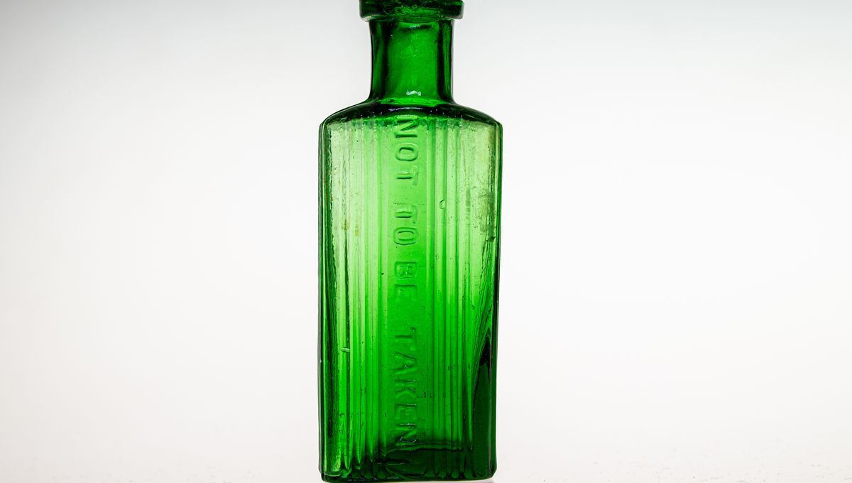
A distinctive, unusually shaped, or intricately textured glass bottle can be an interesting collector’s item or decoration – but for those in the past, these aesthetically pleasing vessels were made for a life-saving reason.
It can’t have been easy staying alive in the Victorian era, from arsenic-tinged wallpaper and books and sweets to… unusual methods of reviving drowning victims. On top of that, in-home electric lighting didn’t become common in the US and UK until the 1920s and 1930s. This certainly posed a problem for those blearily groping around their medicine cabinet by candlelight seeking to soothe a late-night headache, especially if an easily mixed-up bottle contained something deadly.
As the Industrial Revolution allowed the cheap production of many chemicals, some of which were useful around the house but very much not for human consumption, many cases of accidental poisonings were reported in the 1800s. These were often attributed to illiteracy, as well as issues with bad labels and generic packaging. So, glass companies, chemists, and doctors started to make and patent their own bottle designs to help people tell what contained poison and what did not.
In 1829, the state of New York required poison bottles to be labeled with the word “poison”. This was updated to include either the poison label or a skull and crossbones in 1853 by the American Pharmaceutical Association, and then in 1872, the American Medical Association recommended rough texturing on one side of the bottle.
According to the book History of Drug Containers and Their Labels, the earliest illustrated example of a distinctively-shaped glass poison bottle may be “a phial of a particular shape for keeping laudanum” in the Edinburgh New Dispensatory in 1805, which was shaped somewhat like a kid’s ring stacking toy.
The first poison bottles were patented in Britain around the 1860s, with the Federation of Historical Bottle Collectors saying that it was in 1859 by Savory & Barker. In the US, the first poison bottle was patented in 1871, made by Joseph Harrison in a striking cobalt blue shade with a raised diamond pattern.
So how exactly could you tell a bottle of cleaner or pest-control chemicals from your trusty health tonic? The former were usually colored blue, green, and sometimes amber, but that only really helped if you could see them (or were paying attention to what you’d just grabbed).
Therefore, the bottles were also designed to feel distinctive to the touch. One way included using textures as a tactile warning, with one example being Harrison’s diamonds. Bumps, grooves, dimples, ribbing, and ridges were also used, as well as embossing with the word “poison” for a less subtle touch.
The shape of the whole bottle as well as its texture was also a warning. Some bottles were hexagonal, but others had more macabre shapes – some were shaped like coffins, and others like skulls.
So why have bottles of dangerous substances gotten a lot more boring since this period? For one, a lot more of us can read now, and can simply flip on the light or use a torch to ascertain what we are gulping down in the early hours. Also, these unique bottles fascinated children, which is very much not what you would want a bottle of poison to do. However, their visually striking design makes them a treat for modern-day collectors.
Source Link: The Deadly Reason Some Old Glass Bottles Are Textured