Creationists hate it, scientists loathe it even more, yet the “March of Progress” continues to be the defining image of human evolution.
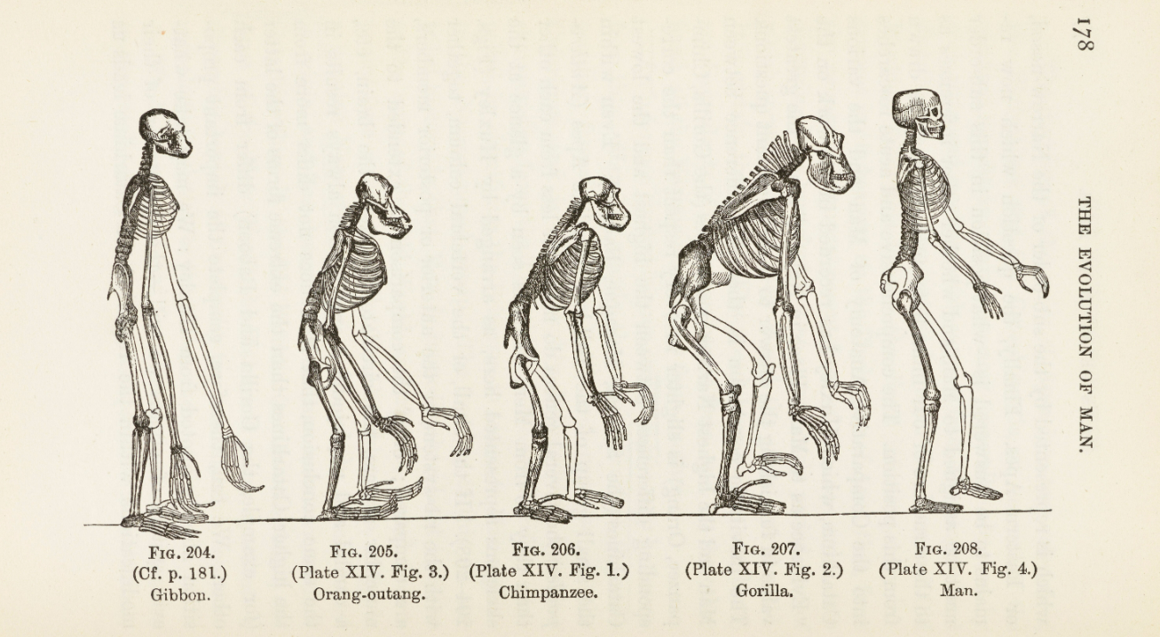
Since its creation in the Victorian era, it’s arguably become one of the most iconic illustrations of modern science. The drawing shows a series of primates going from left to right, starting with hunched ape-like creatures becoming progressively taller and more erect before finally reaching Homo sapiens, standing upright and proud.
The image has stuck in the public consciousness like a warm tongue on a cold pole, appearing in countless textbooks, pop science articles, cartoons, artworks, and memes. There’s just one problem: it’s deeply misleading.
Many of today’s scientists reject the image as it falsely implies that evolution is linear and progressive. In reality, evolution by natural selection is the continual adaptation of organisms to their surroundings; there’s no endpoint and it’s typically a very complex, non-linear journey.
Of all the iconic images, this is the one that infuriates people, but still continues to be used.
Prof. Gowan Dawson
“There are other scientific icons – like Newton’s prism and things like that – but they tend to be ones that scientists approve of. This is the one, I think, that scientists really hate,” Gowan Dawson, a Professor of Victorian Literature and Culture at the University of Leicester, told IFLScience.
“Of all the iconic images, this is the one that infuriates people, but still continues to be used,” added Dawson, who is also an Honorary Research Fellow at the Natural History Museum, London.
Professor Dawson, an academic specializing in the history and art of science in the Victorian age, explains the strange story of how this misleading doodle became an icon in his new book, Monkey to Man: The Evolution of the March of Progress Image.
He explains how the origins of the image can be tied back to a drawing that appeared on the front piece of Thomas Henry Huxley’s 1863 book Evidence as to Man’s Place in Nature, an early foray into human evolution that became hugely influential.

An early interation of the “Man of Progress” featured in a book by Ernst Haeckel, a German zoologist and evolutionist who was a strong proponent of Darwinism.
Image credit: Wellcome Collection
The image – which shows a series of primate skeletons moving from gibbon, orangutan, chimp, gorilla, to human – shocked Victorian readers by daring to suggest there was an evolutionary link between humans and other apes. Even the artist who drew these skeletons for Huxley’s book, a strange man named Benjamin Waterhouse Hawkins, wasn’t a fan of the drawing’s implications.
The gorilla in this famous picture, if you look closely at it, looks as if it’s just about to fall over, rather than proceeding in this kind of progressive way. That’s very much Hawkins and his old hatred of gorillas. He thought that they should actually all be killed off. Yeah, he’s an incredibly weird guy.
Prof. Gowan Dawson
“Hawkins is a well-established natural history artist, but he was opposed to evolution,” Gowan said.
“He was a jobbing freelance artist and he needed the money, he couldn’t afford to say no. Part of the reason that he needs the money – in this very Victorian way – is that he’s a bigamist. He’s married twice and he has two families that don’t know about each other […] so he needs as much money as he can possibly get. He can’t say no to commissions like Huxley’s.”
Gowan even speculates that Hawkins might have attempted to sow anti-evolutionary themes into the drawings, perhaps as a way to subtly undermine its success.
“The gorilla in this famous picture, if you look closely at it, looks as if it’s just about to fall over, rather than proceeding in this kind of progressive way. That’s very much Hawkins and his old hatred of gorillas,” Gowan notes.
“He thought that they should actually all be killed off. Yeah, he’s an incredibly weird guy,” he added.

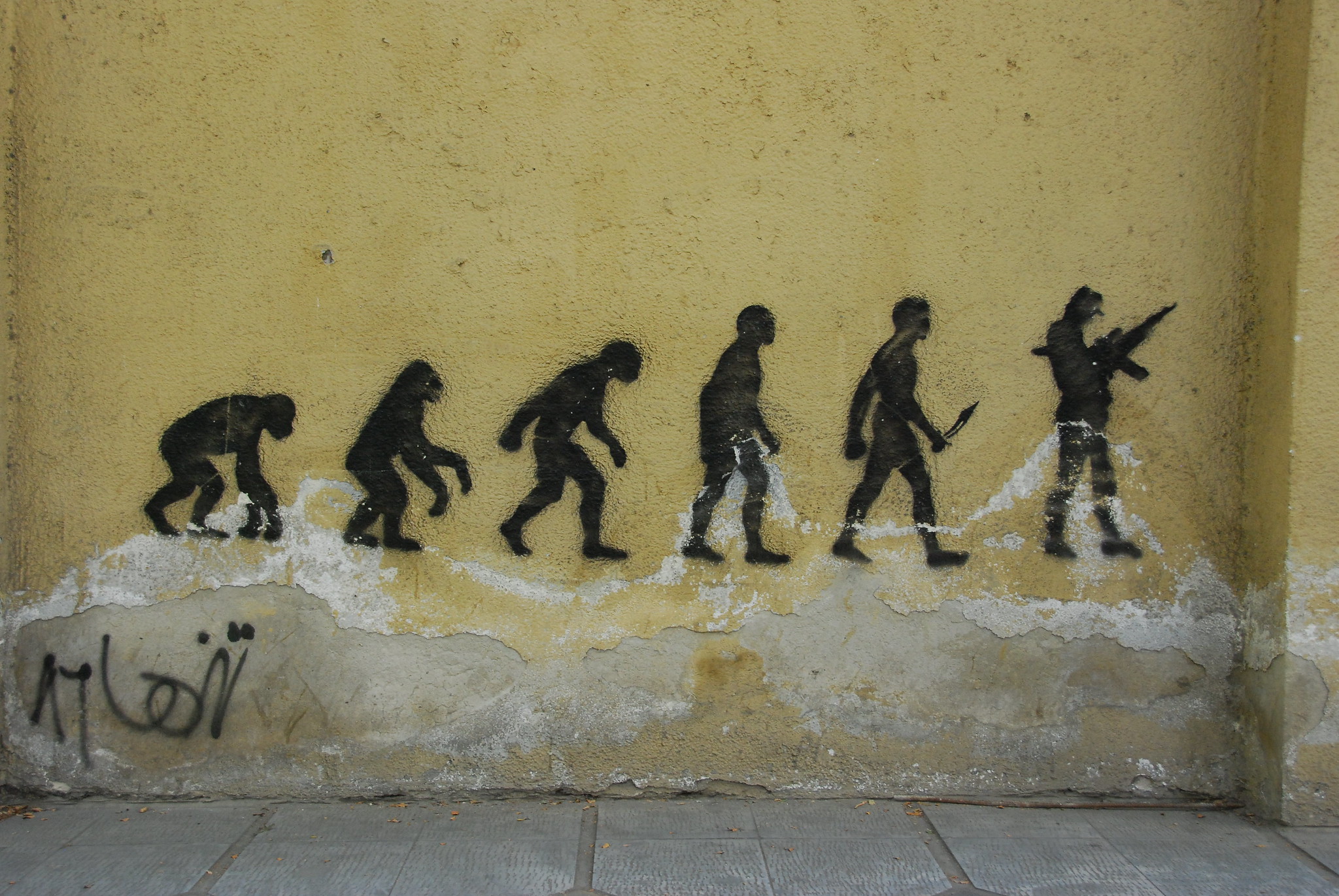
The “March of Progress” is a frequently referenced in pop culture, such as this anti-war street art in Tehran, Iran.
Huxley’s image had some success and started to nestle itself into the milieu of Victorian Britain. A few decades on, it rode another wave of popularity across the Atlantic in the US following the infamous Scopes “Monkey” Trial of 1925, in which science teacher John Scopes was prosecuted for teaching evolution in a Tennessee public school.
Its big break, however, came in 1965 when a foldout illustration of the “March of Progress” image was featured in the Early Man volume of the Life Nature Library, a widely popular book series published by Time-Life.
Unlike the 19th-century image, this illustration didn’t feature skeletons, but artistically reconstructed human ancestors becoming gradually taller. The suggestion of progress – that humans have steadily evolved from beasts to sapiens – was even clearer.
The image was drawn by a famous paleoartist, Rudolph Zallinger. Just like Hawkins, he hated his own image.
Zallinger disliked the linear arrangement of his drawings, which was suggested by the paleoanthropologist Elwyn Simons. He tried to submit other drawings that didn’t imply evolution was progressive and linear, but his suggestions were shot down by the scientists.
“Nowadays, scientists hate this image because they think it misrepresents kind of evolution and their modern view of evolution. But actually it’s the scientists at the time who wanted it drawn in that way, rather than the artists,” Gowan told IFLScience.
Despite its shortcomings, the “March of Progress” has been burnt into all our brains. Google “human evolution” and you’ll be flooded with endless representations and rehashes of the image; some scientific, some humorous. The reasons for its booming popularity are complex, as Gowan writes in his book, but it seems to rest on the fact that it’s undeniably a great image (aesthetically-speaking, at least).
“I think partially it’s because it works so well as an illustration. It’s got a beginning and middle, and it’s got a narrative that you can kind of trace. It’s immediately obvious what it’s saying,” Gowan explained.
“It’s just easy shorthand for evolution. And I’m not sure what other shorthands that we have.”
Human evolution is messy. It’s a knotty story filled with gaping gaps, dead ends, and deeply intertwining relationships. Whenever scientists attempt to show this story in an illustration, it tends to only muddle our understanding, rather than clear up confusion.
Annoyingly, no other image of human evolution has nearly as much aesthetic oomph as the “March of Progress.” It’s just a shame it’s completely wrong.
Source Link: The Famous "March Of Progress" Image Is Wildly Wrong